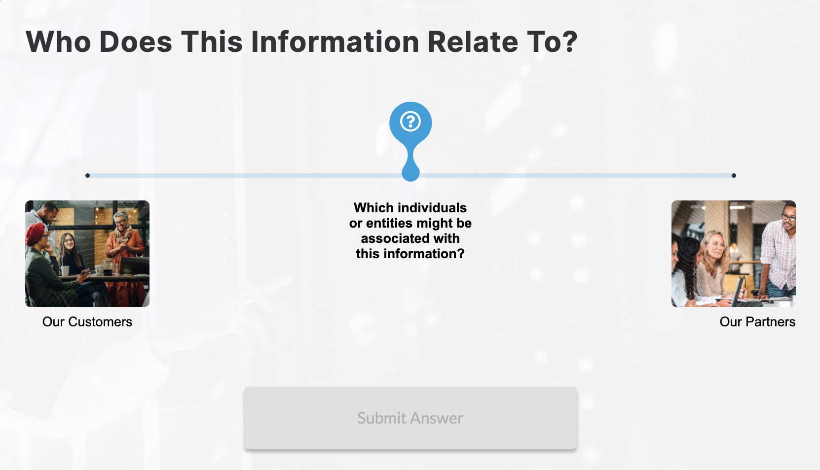
The new interactive block features a slider, allowing learners to make selections in a more engaging and dynamic way.
To add the Slider Block:
1. Open any Flex slide
2. Click the +Add New button and select the Slider block to add it to a Section
To customize content:
Editing Text
- Click on the text in the live preview on the left panel or use the fields in the right panel to edit the following text fields:
- Title Text
- Body Text
- Submit Button Text (optional)
- Click on the Answer Choice cards to edit text fields for the answer choices
Editing the Slider Start Point (optional)
- Select the Slider Start Point card in the main editing pane
- Customize the text
- Add an icon
- Adjust the slider's starting position
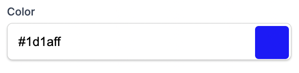
- Choose a custom color for the slider marker
Customizing Answer Choices
The Slider can be configured to include anywhere from 2 to 6 answer choices.
- Click the +Add Answer button to add as many as 6 answer choices
- Click on the Answer choice cards to customize content for each answer choice
- Customize Answer and Feedback text
- Add icon (optional)
- Choose a custom color (optional)
- Add an image asset (optional)
- Add Alt text to your image asset (optional)
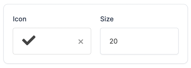
Customizing Icons
- Add or change any icon fields, or change icon size and customize icon color
Block Configurations:
Enabling the Required Click toggle will require learners to click on an item from the checkbox block in order to enable the Continue button for the learner to move forward in the course.
Actions:
A branching action can be applied to individual answer choices, enabling users to view tailored content based on their answer choice selection. To learn more, see the following: