Summary: Shared Dashboards are copies of Template Dashboards that can no longer be edited and have been shared with other users. They contain widgets that visualize information and can be filtered in a number of ways.
Shared Dashboards
The Shared Dashboards option is the first option available in the sidebar menu. A Shared Dashboard is a wrapper that utilizes a specific Sisense host, Template Dashboard, and Data Model, ultimately representing different data with the same visualizations. Shared Dashboards are not editable.
Selecting a Shared Dashboard panel in the above view will open the Shared Dashboard as seen below. Note that there is a Copy sharable link function that produces a URL that will display the view of the Shared Dashboard without needing to be authenticated with the Analytics platform.
Template Dashboards
Template Dashboards are located via the second icon in the left navigation menu. A Template Dashboard focuses on a different aspect of your data and contains a selection of graphs, stats, and visualizations. A Template Dashboard exists within a specific Sisense host and is a page with editable widgets that provides a view of data once applied to a Shared Dashboard.
Template Dashboards are ‘work in progress’ dashboards that can be edited by designers and administrators.
Once a designer is happy with their Template Dashboard and has finalized their changes, it can then be shared with other users as a non-editable ‘Shared Dashboard’ (previously known as a Context).
Shared dashboard example
For example, the Content Performance shared dashboard contains information about the content in your
learning platform. It starts with some simple stats that give an overview of how much content you
have and how learners are interacting with it:
Before moving onto in-depth information like plotting completions on a timeline to examine how they
change over weeks, months, and years.
What do the different Shared Dashboards do?
- Content performance - helps you to spot patterns in the types of content that your organization is
creating and the ways that your learners interact with it. - Groups dashboard - breaks down the activity in your learning platform based on the groups you’ve
created in your LXP. You can investigate the behavior of each group and compare both the size
and behavior of different groups across your platform. - Helicopter view - provides an all-seeing overview of everything on your platform. Like a helicopter
parent, you can keep an eye on everything your learners are doing. - Learning experience activity types - see which types of content your team is creating and how each
is being received by your learners. - Object breakdown - particularly useful to see the composition of your masterclasses and other multilevel courses.
- Time dashboard - examine the correlations between time and activity - from trends across the hours of the day to trends spanning years.
- User sentiment - what do they really think? See how your learners rated your content using the
thumbs-up and thumbs-down options in your LXP. - User stats - who are they, when do they use your LXP, and have they even logged in yet?
Filtering the information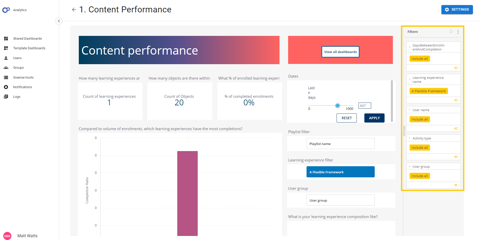
In Analytics, everything is a filter. There are endless ways of drilling down into your data to look
at granular information. The first is by using the Filters column that is on the right side of every
shared and template dashboard.
| You can click Include All to edit each filter. | |
| Toggle the yellow switch to enable and disable each filter. |
Clicking on a piece of data within a widget will also apply a filter. For example, if you click on the highlighted data point in the scatter graph below, the Full_name filter will be updated to include Winifred Henderson.
This filter will apply to your entire dashboard, you can switch it off again by using the aforementioned
filter sidebar on the right or by clicking Clear selection when you hover your cursor over the top right
corner of the widget.
Some shared and template dashboards include text switches like the one shown below, they contain commonly used
filters so that you can quickly swap between different sets of relevant data. Clicking on the grey text
will switch the data you are seeing from one option to the other.
On scatter graphs, you can click and drag your cursor to select the data you want to hone in on, then click Select to create a filter. The filter can be reset/disabled in the same way as other filters.
Analyze it
Some widgets have an Analyze it button when you hover over the top right corner. This gives you access to some machine-learning powered tools.
- Explanations - will identify the anomalies and breaking points in your data. This will help you identify what events or changes may have caused them.
- Forecast - configure and enable the forecast ability, which predicts how your stats will change in the future based on the existing data. In the graph above, the light blue section with the dotted line is the forecasted data.
- Trend - select the type of trend line that you would like to appear on your data and decide which data it should take into account.