The column chart is useful for comparing items and comparing data over time. The chart can include multiple values on both the X and Y-axis, as well as a breakdown by categories displayed on the Y-axis.
Adding data
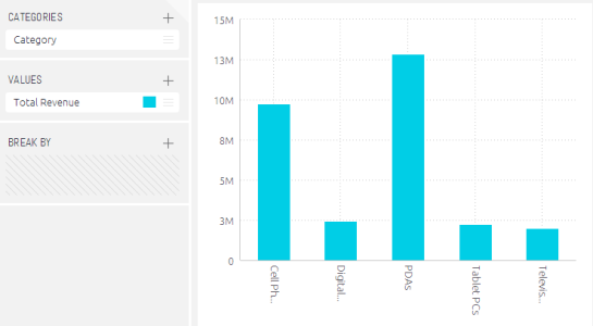
Typically, the x-axis of a column chart is descriptive data. You must add at least one item to categories, and at most, two items.
When two category items are added the chart’s x-axes are automatically grouped. To change the order of the categories, drag a category up or down in the categories list.
One Category Item
Customisations
The colours and titles used in the indicator widget can be adjusted and you can use quick functions to show different data e.g. running sum, % change over time etc. Click here to read our full guide to customising widgets.